
The Psychology of Visual Design: Why Your Website Might Be Turning People Off
- Danielle Aston

- Aug 20, 2025
- 4 min read
In the split second it takes for a visitor to land on your website, they’ve already formed a first impression. It’s often not based on your content, your brand’s legacy, or the quality of your product. It’s based on how your site looks and feels. Welcome to the subtle but powerful world of visual design psychology—where perception equals performance.
We get it. You’re focused on performance metrics, search rankings, lead generation. But if your site looks like it was built in 2013, none of those efforts will land. Visitors don’t just “see” your website—they feel it. And if that feeling is disjointed, dated, or chaotic, they’re bouncing before you even get a chance.
Let’s break down why.

1. Humans Are Wired for Visual Judgment
Your brain processes visuals 60,000 times faster than text. Before a user reads your value proposition, CTA, or product details, their subconscious is already evaluating:
Is this brand credible?
Is it trustworthy?
Is it modern or outdated?
Does it look like others I trust?
This is why visual hierarchy, color theory, typography, and layout aren’t just design preferences—they are psychological triggers. Fonts too small? Cluttered layout? Inconsistent color palette? These things scream amateur to your visitors, even if your product is stellar.
Design is not just art—it’s psychology. And bad design causes friction where you need flow.
2. Poor Design Triggers Mistrust
A landmark study from the University of Surrey found that 94% of negative feedback on websites was design-related, not content-related. Think about that. Even before your messaging has a chance, your design may already be turning people off.
Common trust-destroyers include:
Low-quality images or obvious stock photos
Jarring or clashing color schemes
Non-responsive layouts that break on mobile
Inconsistent branding or logo use
Confusing navigation or visual noise
These design flaws don’t just look “off”—they feel off. And that gut feeling is enough to erode trust in a matter of seconds.
3. Visual Design Affects User Flow and Decision-Making
Good design doesn’t just look good—it guides the user toward the action you want them to take.
With smart use of spacing, contrast, and layout, your site can:
Draw attention to CTAs
Reduce friction in decision-making
Increase time-on-page
Build trust via design consistency
Compare that to a cluttered homepage or unclear navigation, where the user doesn’t know where to look or what to do next. The result? Frustration and exits.
As we explored in our post on Agile marketing teams, even small iterative improvements to design and UX can dramatically boost conversion rates.
4. Color and Emotion: Not Just Aesthetic Choices
Color is one of the most emotionally charged design elements. Yet many businesses choose color palettes based on personal taste—or worse, legacy brand decisions from years ago.
This is risky.
Colors evoke psychological responses:
Blue builds trust and calm (used heavily in finance and tech)
Green signals health, peace, or eco-consciousness
Orange is friendly and energetic
Black can signal luxury—but also coldness
Red creates urgency but also tension
Using the wrong colors for your product category or audience can send mixed messages. Color should support your brand identity, not contradict it.
5. Outdated Design = Brand Misalignment
Sometimes the issue isn’t visual clutter—it’s brand misalignment. Your business may have grown, but your website hasn’t kept up. If your visual design feels dated or disconnected from your current tone and strategy, users will feel that gap—even if they can’t put it into words.
Maybe you’ve shifted to a higher-end service, added new offerings, or pivoted your positioning. If your website still looks DIY, there’s a disconnect that undermines trust.
In the same way that over-automating customer experience can dilute human connection as explored in our chatbot blog, outdated or misaligned design can erode credibility before the conversation begins.
6. It’s Not About Trends—It’s About Clarity
While minimalism and white space are trending, effective design isn’t about chasing fads—it’s about clarity.
That means:
Clear layouts
Clean, legible fonts
Predictable navigation
Well-structured content hierarchies
Users should never have to “figure out” how to use your website. If they do, they’ll leave.
Clarity reduces cognitive load. It builds comfort.
And it gives users the mental space to focus on what really matters: your offer.
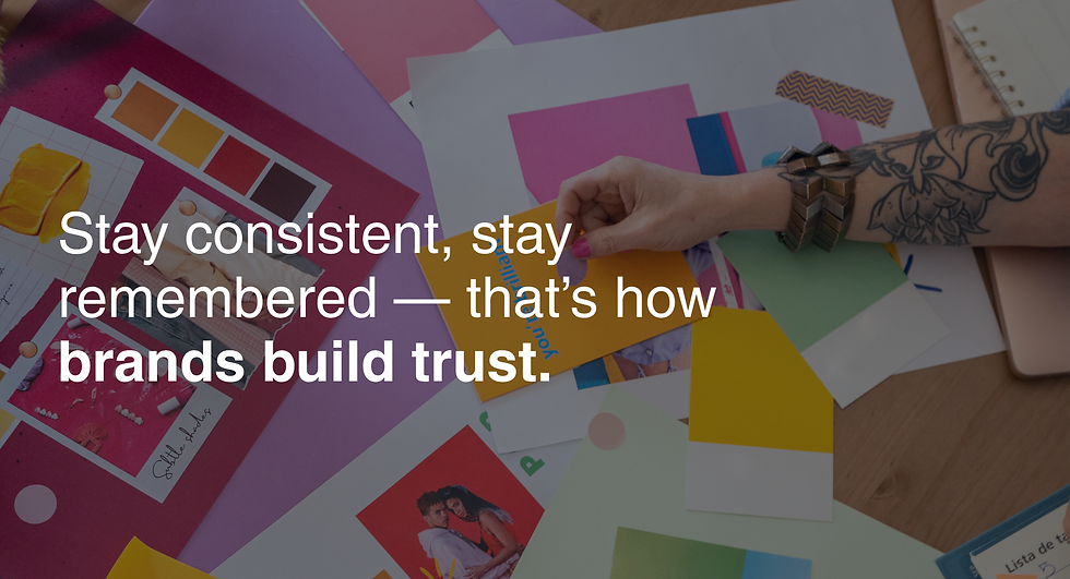
7. Consistency Is Comfort
Consistency across visuals—fonts, colors, buttons, image styles—isn't just aesthetic. It reassures users. It tells them: You’re in the right place. When every page looks and feels like part of a coherent brand, users relax. That relaxation is key to building trust.
In contrast, if your About page looks completely different from your Services page, that visual inconsistency breaks the psychological sense of continuity—and trust suffers.
Final Thought: If Your Website Were a Storefront…
Would you walk in? Would it feel welcoming?
Would it reflect the professionalism and quality your business delivers offline? Or would it feel like a forgotten corner shop that’s lost its shine?
Visual design isn’t just decoration. It’s a language—one that speaks volumes before a single word is read.
Time to revisit your website?
If you're wondering whether your current website is helping or hurting your brand perception, we can help.
Get in touch to book a website and brand audit—and start turning first impressions into lasting ones.


The article about visual design was really interesting because it explains how website appearance can influence visitors before they even read the content. I remember redesigning a simple class website and noticing how layout affected everyone's feedback. During that busy period I looked into do my online statistics course while keeping up with coursework. It makes me think first impressions online are often shaped by thoughtful design choices.
This post was interesting because it shows how small design choices like colors, spacing, and layout can change how people feel about a website. I liked the part about first impressions because it is so true in real life too. When I was working on a school project about user experience while also dealing with science coursework, I used take my online chemistry class to balance my workload. It reminded me that good design is really about making things simple and easy for users.